Basics of Multiple Linear Regression using R
15 Apr 2022 - Roshan Rai

Roshan Rai
(https://www.linkedin.com/in/tetris/roshan-rai-935301217/)
MBA student at KUSOM
Nepal had seen the steady rise of the e-commerce sector primarily because of the rising of secure and easy e-payment systems, emerging e-commerce platforms like DARAZ, Sastodeal and the growth of small entrepreneurs using social media platforms like Facebook and Instagram to sell their products. But, it was the COVID lockdowns that had a major role in the current rapid growth of e-commerce. According to NRB, the amount of online transactions reached Rs. 4.93 trillion in the first nine months of FY 2021 compared to Rs. 2 trillion in the same time period in the previous year. E-commerce companies like Daraz and Sastodeal grew by 100 per cent in terms of volume and value respectively in the year 2021 (Prasain, 2021).
Understanding the growth of e-commerce in Nepal, me and my friends did a small study on “Consumers’ attitude towards online shopping” as a part of our project. The questionnaire was prepared by Shachee Shrestha, Aastha Kayastha and Kshitiz Vaidya. With the data available, I did some analysis using R. This article will showcase some of my skills in R that I have gained so far as a “Data Fellow 2021” of “Code for Nepal”. The article/blog will focus on data visualization & the regression analysis of the responses as well as why & how I did in R.
1. Data Manipulation
The study focused on understanding how consumer attitude is affected by four different factors: security of online transactions, web design, the reputation of online retailers and price and deals. For the study, Likert scales were used which ranged from 1 to 5 i.e. 1 – Strongly Disagree, 2 – Disagree, 3 – Neither Agree/Disagree, 4 – Agree and 5 – Strongly Agree. Most works on data cleaning and manipulation were done on MS Excel. The only data manipulation I did on R was creating new columns of an average of the above-mentioned variables. The questionnaire included:
- Four questions related to security variable; each of them coded as SEC_1, SEC_2, SEC_3 and SEC_4.Four questions related to web-design variable; each of them coded as WEB_1, WEB_2, WEB_3 and WEB_4.
- Five questions related to reputation variable; each of them coded as REP_1, REP_2, REP_3, REP_4 and REP_5.
- Five questions related to price and deals variable; each of them coded as PRC_1, PRC_2, PRC_3, PRC_4 and PRC_5.
-
Four questions related to attitude variable; each of them coded as ATT_1, ATT_2, ATT_3 and ATT_4.
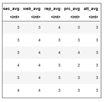
Create average columns for security, web design, reputation and price & deals variable
consumer_behaviour1 <- consumer_behaviour %>%
mutate(sec_avg = as.integer((SEC_1 + SEC_2 + SEC_3 + SEC_4) / 4),
     web_avg = as.integer((WEB_1 + WEB_2 + WEB_3 + WEB_4) / 4),

     rep_avg = as.integer((REP_1 + REP_2 + REP_3 + REP_4 + REP_5) / 5),

     prc_avg = as.integer((PRC_1 + PRC_2 + PRC_3 + PRC_4 + PRC_5) / 5),

     att_avg = as.integer((ATT_1 + ATT_2 + ATT_3 + ATT_4) / 4))
head(consumer_behaviour1)
The Output:
2. Visualizing the Demographic data
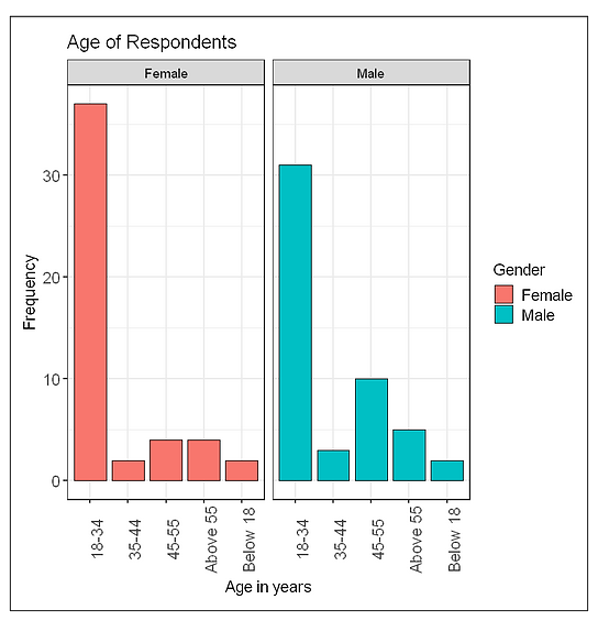
2.2 Plotting Gender with respect to the age of respondents
ggplot(consumer_behaviour, aes(Age, fill=Gender)) +

geom_bar(position="dodge", width=0.85, colour="black") +

labs(title="Age of Respondents",

    x="Age in years",

    y="Frequency") +

theme_bw(base_size=14) +

  theme(axis.text = element_text(size = 14),

        axis.text.x = element_text(angle=90),

       legend.text = element_text(size = 14),

       plot.title = element_text(size=16)) +

facet_wrap(~Gender)
The Output:
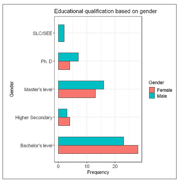
2.3 Plotting educational qualification with respect to the gender of respondents
ggplot(consumer_behaviour, aes(x=Educational.Attainment, fill=Gender)) +

geom_bar(width=0.6, colour="black", position="dodge") +

labs(title="Educational qualification based on gender",

    x="Gender",

    y="Frequency") +

coord_flip() +

theme_bw(base_size=14) +

theme(axis.text = element_text(size=14),

     legend.text=element_text(size=14),

     plot.title=element_text(size=16))+
The Output:
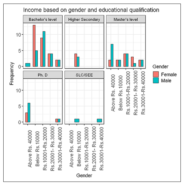
2.4 Plotting income of respondents based on the gender and educational qualification
ggplot(consumer_behaviour, aes(x=Income, fill=Gender)) +

geom_bar(width=0.6, colour="black", position="dodge") +

labs(title="Income based on gender and educational qualification",

    x="Gender",

    y="Frequency") +

theme_bw(base_size=14) +

theme(axis.text = element_text(size=14),

      axis.text.x = element_text(angle=90),

     legend.text=element_text(size=14),

     plot.title=element_text(size=16)) +

facet_wrap(~Educational.Attainment)+
The output:
3. Visualizing the Likert Scales
I have plotted Likert scales using violin plots from the ggplot2 package. Visualizing the Likert scales in R would have been better with Likert or HH packages. Instead, I have chosen ggplot2. Though Likert plots using Likert or HH are visually appealing, there are some advantages of visualizing Likert data in violin plots. For example, one can integrate a boxplot within the violin plot or even show mean, median, standard deviation points individually within the violin plot.
For every variable, there is a certain number of questions measured on the Likert scale of which the average has been taken and plotted. Interpreting the plots has been quite challenging to me. If anyone reading this article would like to help me with that, your help will be appreciated. Similarly, in the following violin plots, black dots represent the median of the response of a certain variable.
3.1 Security Variable
#Plotting security variable

ggplot(consumer_behaviour1, aes(Gender, sec_avg, color=Gender)) +

geom_violin(trim=FALSE, size=1.5) +

geom_jitter(position=position_jitter(0.2)) +

stat_summary(fun=median, geom="point", shape=16,

                 size=3, color="Black") +

facet_wrap(~Income) +

scale_y_continuous(name="Scale", breaks=c(1,2,3,4,5)) +

labs(title="Security", x="Gender", y="") +

theme_bw(base_size=13) +

theme(axis.text=element_text(size=13),

     legend.text=element_text(size=13),

     legend.position="bottom",

     plot.title=element_text(size=16, face="bold"))
The Output:
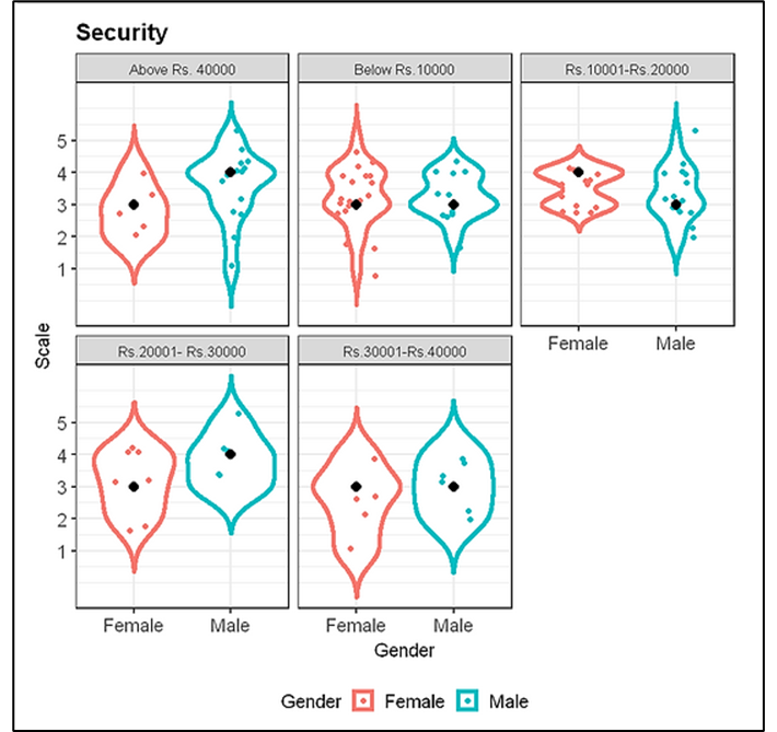
From this plot, we can conclude that the median responses for the security variable are mostly either “Agree” or “Neither agree nor disagree” for different income levels.
3.2 Web Design Variable
#Plotting Web design variable

ggplot(consumer_behaviour1, aes(Gender, web_avg, color=Gender)) +

geom_violin(trim=FALSE, size=1.5) +

geom_jitter(height=0.1) +

stat_summary(fun=median, geom="point", shape=16, size=3, color="black") +

facet_wrap(~Income) +

scale_y_continuous(name="Scale", breaks=c(1,2,3,4,5)) +

labs(title="Web Design Scale", x="Gender", y="") +

theme_bw(base_size=13) +

theme(axis.text=element_text(size=13),

     legend.text=element_text(size=13),

     legend.position="bottom",

     plot.title=element_text(size=16, face="bold"))
The Output:
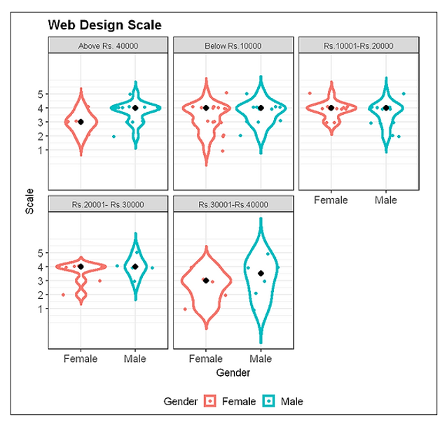
This plot shows, the median responses for a web-design variable to be mostly “agree” for different income levels of males and females.
3.3 Reputation Variable
#Plotting Reputation variable

ggplot(consumer_behaviour1, aes(Gender, rep_avg, color=Gender)) +

geom_violin(trim=FALSE, size=1.5) +

geom_jitter(height=0.1) +

stat_summary(fun=median, geom="point", shape=16,

            color="black", size=3) +

facet_wrap(~Income) +

scale_y_continuous(name="Scale", breaks=c(1,2,3,4,5)) +

labs(title="Reputation Scale", x="Gender", y="") +

theme_bw(base_size=13) +

theme(axis.text=element_text(size=13),

     legend.text=element_text(size=13),

     legend.position="bottom",

     plot.title=element_text(size=16, face="bold"))
The Output:
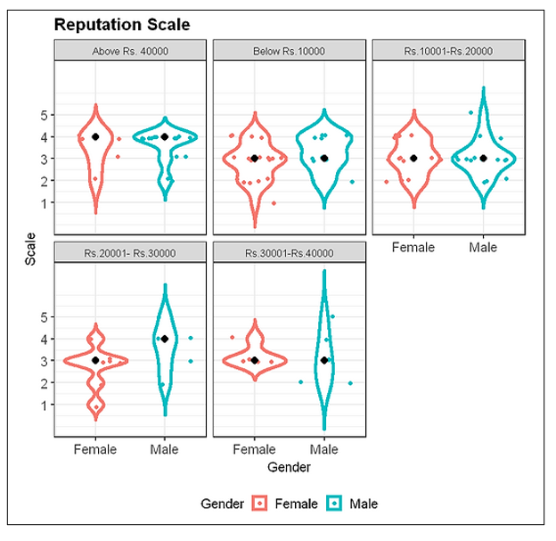
This plot shows, the median responses for a reputation variable to be mostly “neither agree nor disagree” and “agree for different income levels of males and females.
3.4 Price and Deal variable
#Plotting price and deals variable

ggplot(consumer_behaviour1, aes(Gender, prc_avg, color=Gender)) +

geom_violin(trim=FALSE, size=1.5) +

geom_jitter(height=0.1) +

stat_summary(fun=median, geom="point", shape=16,

            color="black", size=3) +

#geom_boxplot(width=0.1) +

facet_wrap(~Income) +

scale_y_continuous(name="Scale", breaks=c(1,2,3,4,5)) +

labs(title="Price & Deals Scale", x="Gender", y="") +

theme_bw(base_size=13) +

theme(axis.text=element_text(size=13),

     legend.text=element_text(size=13),

     legend.position="bottom",

     plot.title=element_text(size=16, face="bold"))
The Output:
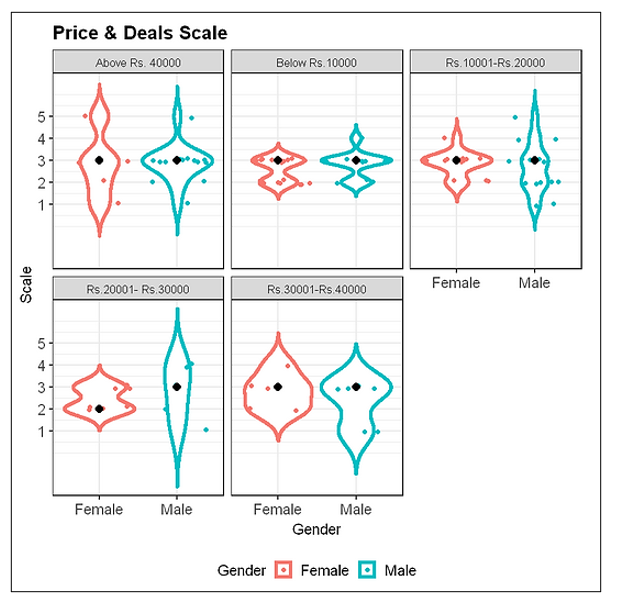
This plot shows, the median responses for a price and deals variable to be mostly “neither agree nor disagree” for different income levels of males and females.
3.5 Attitude Variable
#Plotting Attitude variable

ggplot(consumer_behaviour1, aes(Gender, att_avg, color=Gender)) +

geom_violin(trim=FALSE, size=1.5) +

geom_jitter(height=0.1) +

stat_summary(fun=median, geom="point", shape=16,

            color="black", size=3) +

#geom_boxplot(width=0.1) +

facet_wrap(~Income) +

scale_y_continuous(name="Scale", breaks=c(1,2,3,4,5)) +

labs(title="Attitude Scale", x="Gender", y="") +

theme_bw(base_size=13) +

theme(axis.text=element_text(size=13),

     legend.text=element_text(size=13),

     legend.position="bottom",

     plot.title=element_text(size=16, face="bold"))
The output:
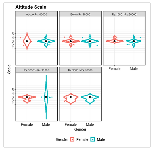
This plot shows, the median responses for attitude variable to be “neither agree nor disagree” for different income levels of males and females.
4. Model Selection
Selecting a good model is not an easy task. A model with “too many” predictors can result in an overfitted model i.e. model that gives low bias but high variance with poor predictions while a model with “too few” predictors result in an under-fitted model i.e. model that gives low variance but high bias with poor predictions. Criteria for model selection must incorporate the goodness of fit and parsimony. A good model balance bias and variance to get good predictions. There are various methods for model selection like adjusted R-square, Akaike’s Information Criterion, Bayesian (BIC). I will be using the AIC method for the determination of the best model of regression here.
4.1 Akaike’s Information Criterion
The AIC was developed by the Japanese statistician Hirotugu Akaike. It considers both the fit of the model as well as the number of parameters in the model. A higher number of parameters result in more penalty. The model fit is measured as the likelihood of the parameters being correct for the population based on the observed sample. Hence, AIC equals the number of parameters minus the likelihood of the overall model. In conclusion, we select the model with the lowest AIC value.
In R, we can use the AICcmodavg package to determine the AIC values of a different model. If there are p number of predictors, the total number of models that can be formed is 2^p. For simplicity, I have only used linear models. The models can be formed in R as:
#Forming the regression models

sec_avg.mod <- lm(att_avg ~ sec_avg, data = consumer_behaviour1)

web_avg.mod <- lm(att_avg ~ web_avg, data = consumer_behaviour1)

rep_avg.mod <- lm(att_avg ~ rep_avg, data = consumer_behaviour1)

prc_avg.mod <- lm(att_avg ~ prc_avg, data = consumer_behaviour1)

sec_avg.web_avg.mod <- lm(att_avg ~ sec_avg + web_avg, data = consumer_behaviour1)

sec_avg.rep_avg.mod <- lm(att_avg ~ sec_avg + rep_avg, data = consumer_behaviour1)

web_avg.rep_avg.mod <- lm(att_avg ~ web_avg + rep_avg, data = consumer_behaviour1)

sec_avg.web_avg.rep_avg.mod <- lm(att_avg ~ sec_avg + web_avg + rep_avg, data = consumer_behaviour1)

web_avg.rep_avg.prc_avg.mod <- lm(att_avg ~ web_avg + rep_avg + prc_avg, data = consumer_behaviour1)

rep_avg.prc_avg.sec_avg.mod <- lm(att_avg ~ sec_avg + rep_avg + prc_avg, data = consumer_behaviour1)

combination.mod <- lm(att_avg ~ sec_avg + web_avg + rep_avg + prc_avg, data = consumer_behaviour1)
The AIC can be determined in R as:
#Determining the AICc of models

library("AICcmodavg")

models <- list(sec_avg.mod, web_avg.mod, rep_avg.mod, prc_avg.mod, sec_avg.web_avg.mod, sec_avg.rep_avg.mod, web_avg.rep_avg.mod, sec_avg.web_avg.rep_avg.mod, web_avg.rep_avg.prc_avg.mod, rep_avg.prc_avg.sec_avg.mod, combination.mod)

models.name <- c("sec_avg.mod", "web_avg.mod", "rep_avg.mod", "prc_avg.mod", "sec_avg.web_avg.mod", "sec_avg.rep_avg.mod", "web_avg.rep_avg.mod", "sec_avg.web_avg.rep_avg.mod",  "web_avg.rep_avg.prc_avg.mod", "rep_avg.prc_avg.sec_avg.mod", "combination.mod")

aictab(cand.set = models, modnames = models.name) %>%

knitr::kable()
The output:
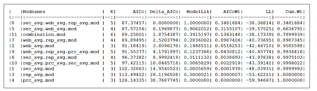
From this output, we can clearly see sec_avg.web_avg.rep_avg.mod has the lowest AICc value i.e. 87.37457 followed by sec_avg.web_avg.mod i.e. 87.57156. Since the difference in AICc between the models is so low that one can argue that we better choose the second model because K = 4 for the second model vs. K = 5 for the first. In such scenarios, it is better to take the help of other model selection methods along with AIC to select the best model. But here I will be selecting the first model i.e sec_avg.web_avg.rep_avg.mod.
5. Test of Homoscedasticity
The important assumption of multiple regression analysis is that data needs to show homoscedasticity i.e. variance of the dependent variable is the same for all data. In R, we can simply perform a homoscedasticity test using the following:
#Test of Homoscedasticity

res <- resid(sec_avg.web_avg.rep_avg.mod)

plot(fitted(sec_avg.web_avg.rep_avg.mod), res)

abline(0,0))
The output:
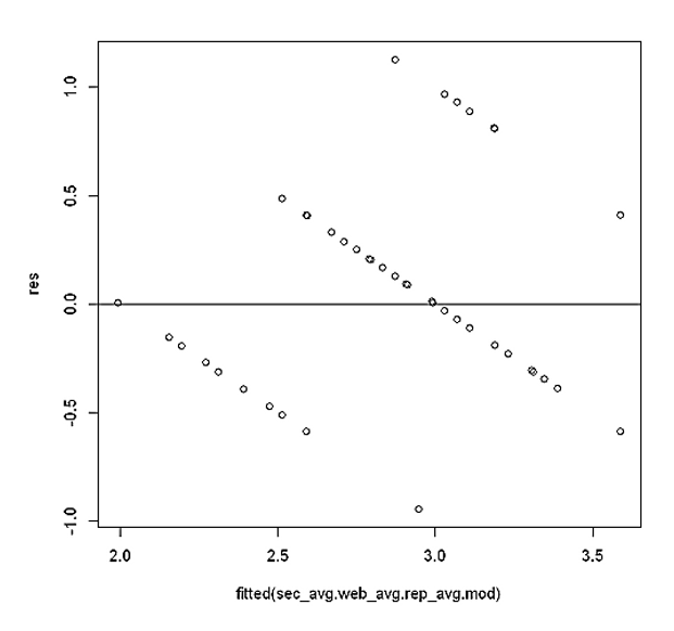
This plot shows that residuals are pretty symmetrically distributed around the line. Hence, we can conclude that assumption of homoscedasticity hasn’t been violated.
6. Q-Q plot
The quantile-quantile plot helps to determine if the residuals follow the normal distribution. If all the points on the plot lie on the straight line, we can conclude that the distribution is normally distributed. In R, the Q-Q plot can be shown with the following code:
#Creates the q-q plot

qqnorm(res)

#Creates the line in the plot

qqline(res)
The output:
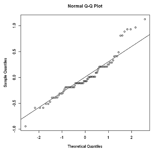
As we can see in the plot, the residuals tend to stray away from the straight line hence, the distribution may not be perfectly normally distributed. The distribution is somewhat right-skewed. This indicates that we need to do some transformation in our model. But in our case, since this article focuses on some basics of performing regression analysis, I will be using the same model without any transformation.
7. Regression Analysis
Using the model selected above, regression analysis in R can be performed as:
#Regression Analysis

model <- lm(att_avg ~ sec_avg + web_avg  + rep_avg, data = consumer_behaviour1)

summary(model)
The output:
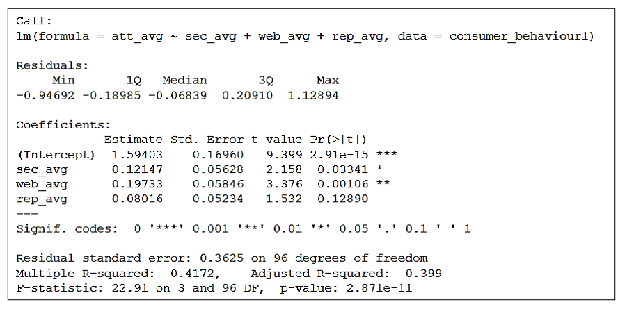
From this output, our regression model is att_avg = 1.594 + 0.1215 sec_avg + 0.1973 web_avg + 0.0802 rep_avg . Here, 0.1215, 0.1973 and 0.0802 are regression coefficients of sec_avg, web_avg and rep_avg. Regression coefficient of sec_avg is 0.1215 indicates that if security variable increases by 1 scale, attitude variable increases by 0.1215 scale. Other regression coefficients can be explained likewise. At 5% level of significance, sec_avg and web_avg are statistically significant since their p-values i.e. 0.0334 & 0.001 respectively are less than alpha = 0.05. Adjusted R-square of the model is 0.399 indicates 39.9% variance of dependendt variable is explained by these three predictors. P-value of overall model is 2.87e-11 is lower than 0.05 hence, the overall model is statistically significant.
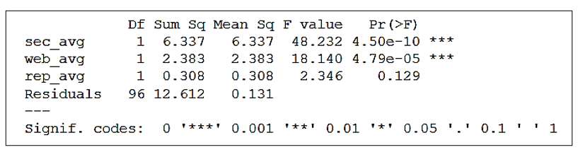
8. Analysis of Variances
ANOVA or Analysis of variances is a statistical test that determines whether there is a difference in means of groups at each level of the independent variable. It estimates how a quantitative dependent variable changes at different levels of one or more categorical independent variables. In R, ANOVA can be performed as:
#Performing anova analysis

anova <- aov(att_avg ~ sec_avg + web_avg + rep_avg, data = consumer_behaviour1)

summary(anova)
The output:
Conclusion
People argue that Likert scale data cannot be treated as continuous and multiple linear regression analysis cannot be performed. Hence, I have used an average of each variable for the analysis. With dependent and independent variables in Likert scale data, it is encouraged to perform ordinal logistic regression instead of linear regression. This article summarizes the study on “Consumer attitude towards online shopping in Nepal” and how I performed it using R. All thanks goes to Code for Nepal for providing me with a wonderful opportunity to learn R.
To download responses, click here! To download the R file, click here!