Using Machine Learning for Finding out the Red Wine Quality
18 Dec 2023 - Prabesh Bashyal
We all know about the significance of red wine these days. It is also better to know better about its quality and the factors which can affect its quality. In these terms, we can use our computer knowledge of ML, and predict ourselves the quality based on the different physicochemical properties. Now, this will be an estimation on the quality and people will be aware about that.

Personally, I feel like people should learn the concepts of ML not for something as hesitant, but for the study and learning the nature of relationships and predictions based on our algorithms. That way they can be confident in their results and seek better results not just on some particular aspects but on everything that has target and response variables.
Here, for the quality of red wine, I am using the dataset from 2009 from the Kaggle. I will be highlighting the procedure on the data visualization, preprocessing and model prediction and finally will focus on its significance.
I. Dataset
The dataset is from the following link in Kaggle:
https://www.kaggle.com/datasets/uciml/red-wine-quality-cortez-et-al-2009 ?datasetId=4458&sortBy=voteCount. Here is a quick snapshot of the data frame.

We carry a basis test on the data frame to check whether there are any null entries or not and are there any duplicated items and perform the summary statistics on the dataset and the result is as follows. There were no null entries but 240 duplicated rows and we dropped those duplicated rows.

II. Data Preprocessing
Now, we import the libraries, and we did a bit of analysis on the data by visualizing the probability density as it gives us insight on the distribution of data. We have already imported pandas and displayed the data, so we won’t be importing the dataset and named the dataset as redwine_df_cp.
import seaborn as sns
import matplotlib.pyplot as plt
import numpy as np
import warnings

warnings.filterwarnings('ignore')
plt.style.use('seaborn')
fig = plt.figure(figsize=(15,15))

for index, column in enumerate(redwine_df_cp.columns):
  plt.subplot(4,3,index+1)
  sns.distplot(x = redwine_df_cp.loc[:, column], color = 'lightseagreen')
  plt.title(column, size = 13)
  fig.tight_layout()
  plt.grid(True)
plt.show()
The result was as follows:
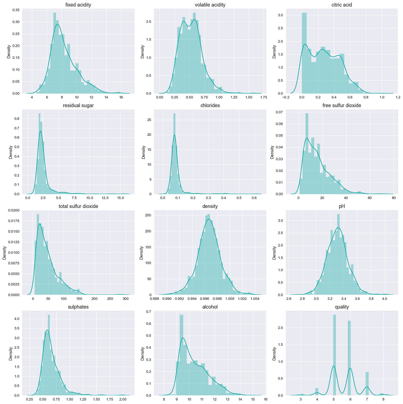
Here, we can see that there are some datasets like chlorides which are right tailed in distribution that might be due to outliers. Now for simplicity we don’t touch outliers yet and will simply explore the dataset.
Now, we will try to check the correlation between different variables using the correlation coefficient and seaborn heatmap.
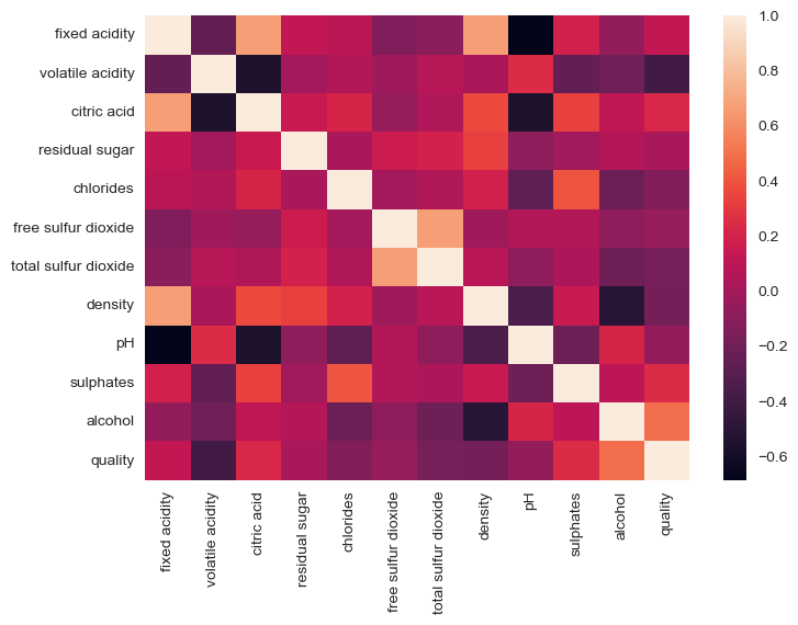
From the above heatmap, we can see that there is a positive correlation with alcohol of quality and negative with volatile acidity the most. So, we will be taking these two as prime factors for now and will be seeing their scatterplot/catplot and will see whether they are related or not.
sns.catplot(data=redwine_df_cp, x="quality", y="alcohol", hue="quality")
plt.show()
sns.catplot(data=redwine_df_cp, x="quality", y="volatile acidity", hue="quality")
plt.show()
The result of the categorical plot is as follows:
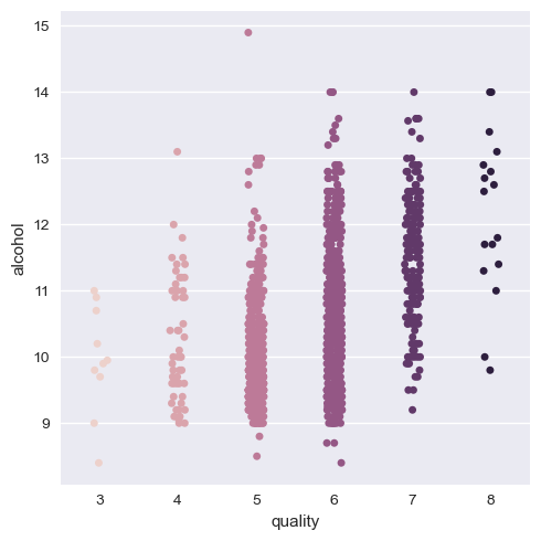
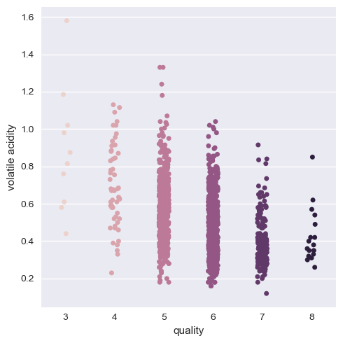
Here, we can see that there is indeed a positive correlation with quality of alcohol as we can think about and negative with volatile acidity. But it is better if we group the quality as a group of three categories as low, medium and high quality wines. That way data visualization and training is easy and less mundane.
So, we create another copy of the dataframe to preserve the structure of the dataset.
redwine_test_df = redwine_df_cp.copy()
redwine_test_df.head()

# Let's define a function to help us.
def quality_value(value):
  value = str(value)
  if value == '3':
    value = value.replace('3','low')
    return value
  elif value == '4':
    value = value.replace('4','low')
    return value
  elif value == '5':
    value = value.replace('5','medium')
    return value
  elif value == '6':
    value = value.replace('6','medium')
    return value
  elif value == '7':
    value = value.replace('7','high')
    return value
  elif value == '8':
    value = value.replace('8','high')
    return value


redwine_test_df['quality'] = redwine_test_df['quality'].apply(quality_value)
redwine_test_df["quality"].unique()
Now, we will again see the categorical plot of the alcohol and volatile acidity with quality.
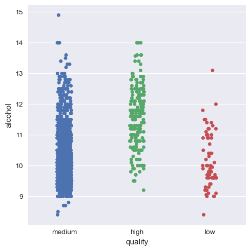
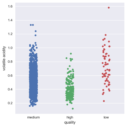
As we can see now, it’s much more visual and definitive to say that there is indeed positive correlation and negative correlation of alcohol and volatile acidity with quality respectively.
Now, we will visualize this for the rest of the variables.
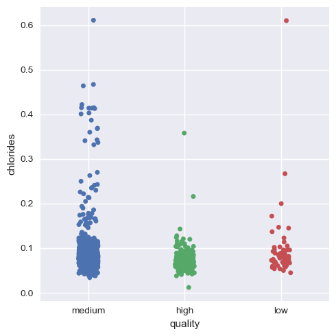
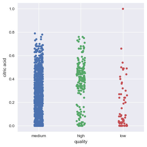
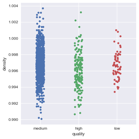
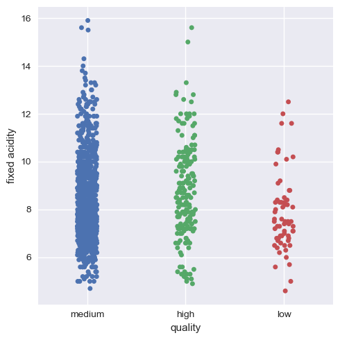
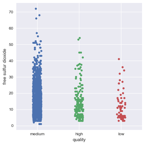
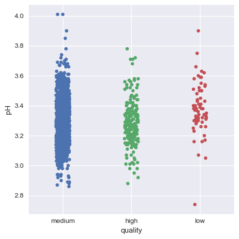
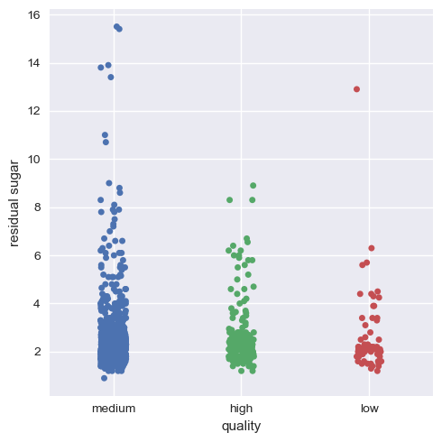
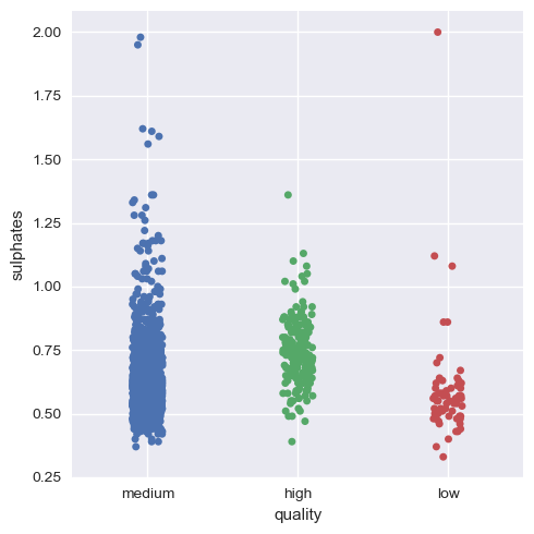
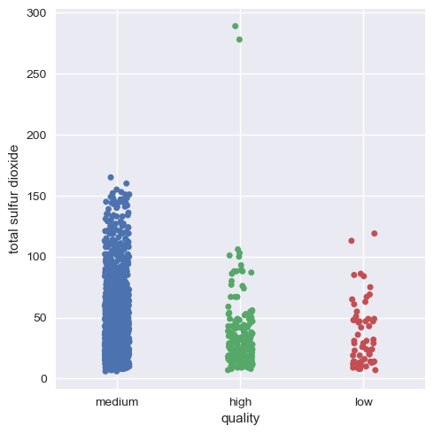
Hence, we can infer that as a whole all these factors contribute to the quality of red wine, with alcohol and volatile acidity as key factors.
Now, we will get onto seeing the dataset and visualizing the outliers for this we use seaborn boxplot.
fig = plt.figure(figsize=(15,15))
for index,column in enumerate(list(redwine_test_df.columns[:-1])):
  plt.subplot(4,3,index+1)
  sns.boxplot(y =redwine_test_df.loc[:, column], x =redwine_test_df['quality'],
  linewidth=2.5)
  plt.title(column, size = 12)
fig.tight_layout()
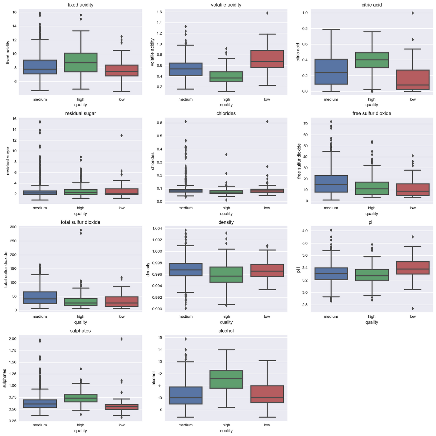
Here, we can see the outliers in the physicochemical properties, but we won’t clear them all out. We highlight the outlier with high distribution i.e. chlorides for this purpose and we will impute median in the outlier. The code is as follows:
df_chlorides = redwine_test_df['chlorides']
# distribution of the variable before cleaning
plt.figure(figsize=(8,5))
plt.title('With Outliers')
sns.distplot(x = df_chlorides, color = '#967bb6')
# setting the threshold value
Q1 = df_chlorides.quantile(0.25)
Q3 = df_chlorides.quantile(0.75)
# interquartile range
IQR = Q3 - Q1
lower_limit = Q1 - 1.5 * IQR
upper_limit = Q3 + 1.5 * IQR
# catching outliers
upper_outlier = (df_chlorides > upper_limit)
# determining the mean and median values
mean = df_chlorides.mean()
median = df_chlorides.median()
# assigning outliers to median due to its suitability
df_chlorides[upper_outlier] = median
# distribution of the data without outliers
plt.figure(figsize=(8,5))
plt.title('Without Outliers')
sns.distplot(x = df_chlorides, color = 'lightseagreen')
The result before and after is as follows for chloride column:
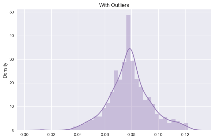
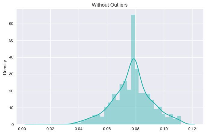
As, we can see the change in the dataset before and after the outlier. We will see its effect in the model performance and accuracy later on. For now, we will stick with other outliers as looking at the boxplot, other outliers don’t have much impact on the model accuracy and performance.
III. Classification
Now, we import all the libraries required for classification.
from imblearn.over_sampling import SMOTE
from sklearn.preprocessing import StandardScaler
from sklearn.model_selection import train_test_split, cross_val_score
from sklearn.metrics import accuracy_score, confusion_matrix,
classification_report
import catboost as cb
import xgboost as xgb
import lightgbm as lgb
from sklearn.naive_bayes import GaussianNB
from sklearn.svm import SVC
from sklearn.tree import DecisionTreeClassifier
from sklearn.neighbors import KNeighborsClassifier
from sklearn.linear_model import LogisticRegression
from sklearn.ensemble import RandomForestClassifier, AdaBoostClassifier
Here some classifiers needs the quality column to be values such as 0, 1,2 so we switch it back accordingly.
redwine_test_df['quality'] = redwine_test_df['quality'].map({'high': 2, 'medium':
1, 'low': 0})
redwine_test_df['quality'].unique()
Now, we separate the dataset into dependent and independent variables.
y = redwine_test_df["quality"]
x = redwine_test_df.drop(["quality"], axis=1)
X_train, X_test, y_train, y_test = train_test_split(x, y, test_size=0.2,
random_state=40)
Now, the main thing here is Standardizing the data. The reason behind the standardization is making the data comparable by eliminating the difference in measurement units in the table. For this we use standard scalar.
scaler = StandardScaler()
X_train = scaler.fit_transform(X_train)
X_test = scaler.transform(X_test)
Then, we use SMOTE technique for removing the class imbalance
smote = SMOTE(random_state=40)
X_train, y_train = smote.fit_resample(X_train, y_train)
sns.countplot(y=y_train)
plt.show()
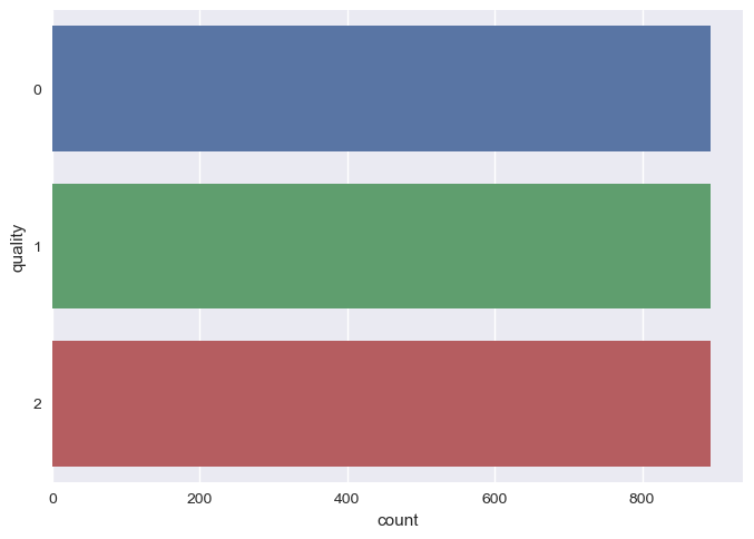
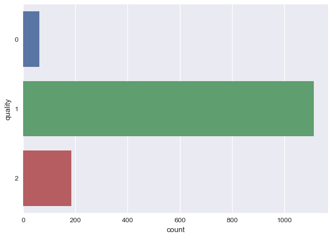
After and Before SMOTE Technique
Now, we use the models for applying the ML.
models = [
('Logistic Regression', LogisticRegression()),
('Support Vector Classifier', SVC()),
('Naive Bayes', GaussianNB()),
('KNN', KNeighborsClassifier()),
('Decision Tree', DecisionTreeClassifier()),
('Random Forest', RandomForestClassifier()),
('XGBoost', xgb.XGBClassifier()),
('LightGBM', lgb.LGBMClassifier()),
('CatBoost', cb.CatBoostClassifier(verbose=0)),
('AdaBoost', AdaBoostClassifier())
]

conf_matrices = []
class_reports = []
outcomes = []

for model_name, model in models:
  cv_results = cross_val_score(model, X_train, y_train, cv=5)
  mean_accuracy = cv_results.mean()
  model.fit(X_train, y_train)
  y_pred = model.predict(X_test)
  accuracy = accuracy_score(y_test, y_pred)
  cm = confusion_matrix(y_test, y_pred)
  cr = classification_report(y_test, y_pred)
  conf_matrices.append((model_name, cm))
  class_reports.append((model_name, cr))
  outcomes.append((model_name, mean_accuracy, accuracy))

df_results = pd.DataFrame(outcomes, columns=['Model', 'Cross-Validation
Accuracy', 'Test Accuracy'])
df_results.sort_values('Cross-Validation Accuracy', ascending=False,
inplace=True)

df_results
The result of the test accuracy and other reports are as follows:
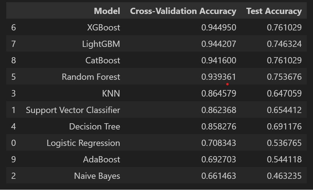
Here, we can see that CatBoost and XGBoost are high in test accuracy, but let’s see the classification report and confusion matrices to find out which model to use and tune.
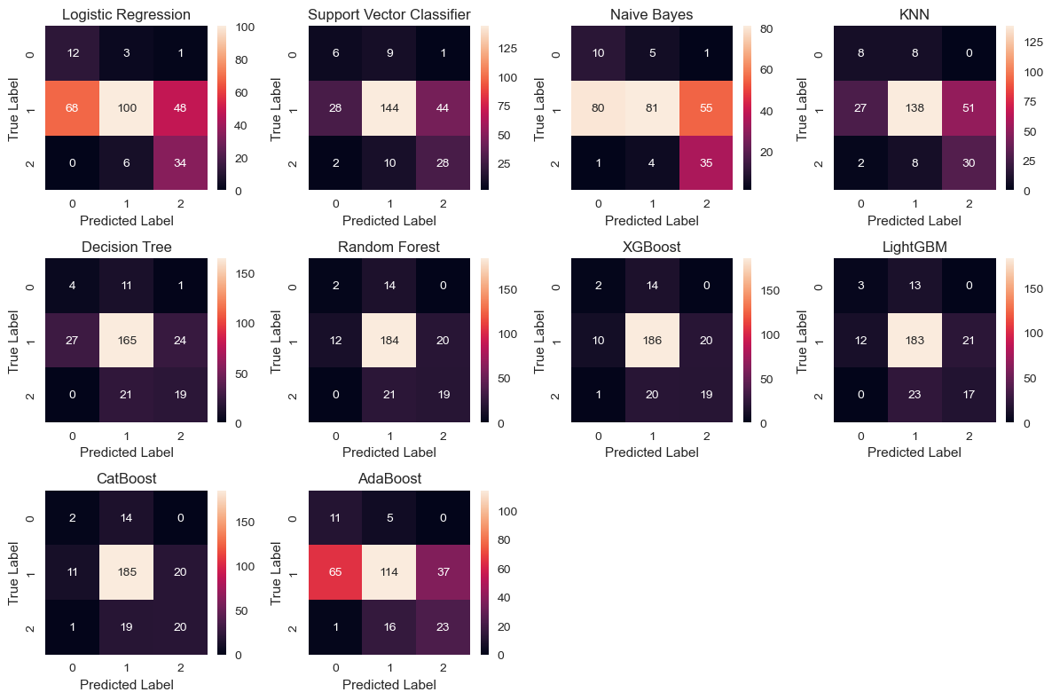
plt.figure(figsize=(12, 8))
for i, (model_name, cm) in enumerate(conf_matrices, 1):
  plt.subplot(3, 4, i)
  plt.title(model_name)
  sns.heatmap(cm, annot=True, fmt='d')
  plt.xlabel('Predicted Label')
  plt.ylabel('True Label')

plt.tight_layout()
plt.show()
The confusion matrices are depicted below:
The classification reports are as follows:
for model_name, cr in class_reports:
  print(f'033[1m{model_name}:033[0m')
  print(f'033[1mClassification Report:033[0m')
  print(cr)
  print('-'*60)
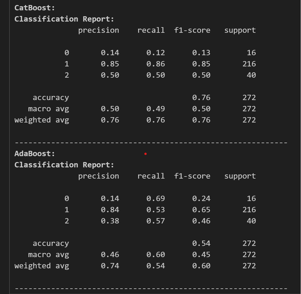
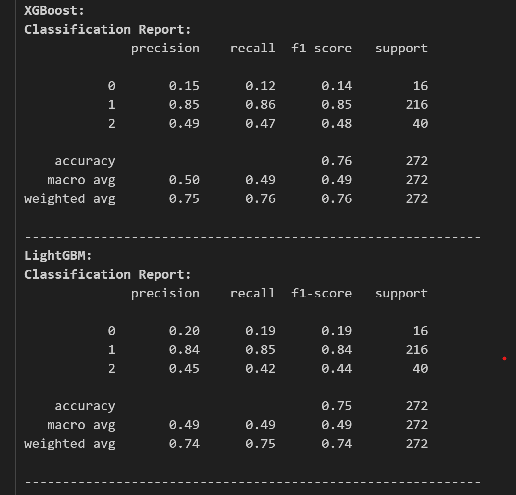
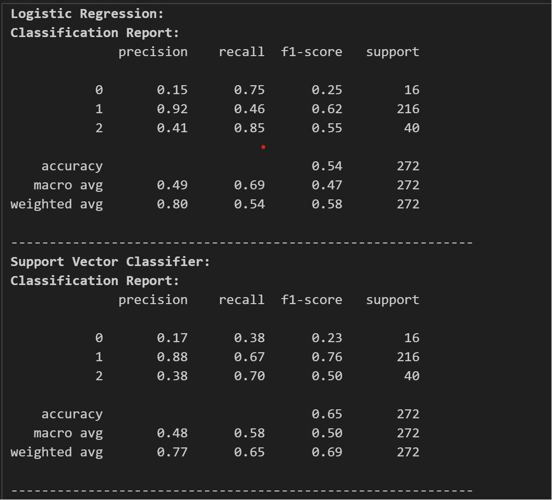
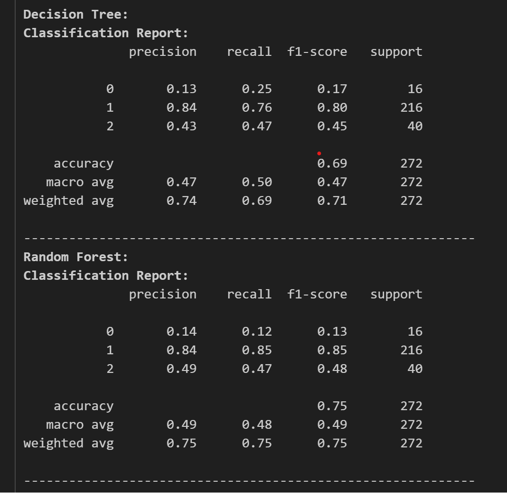
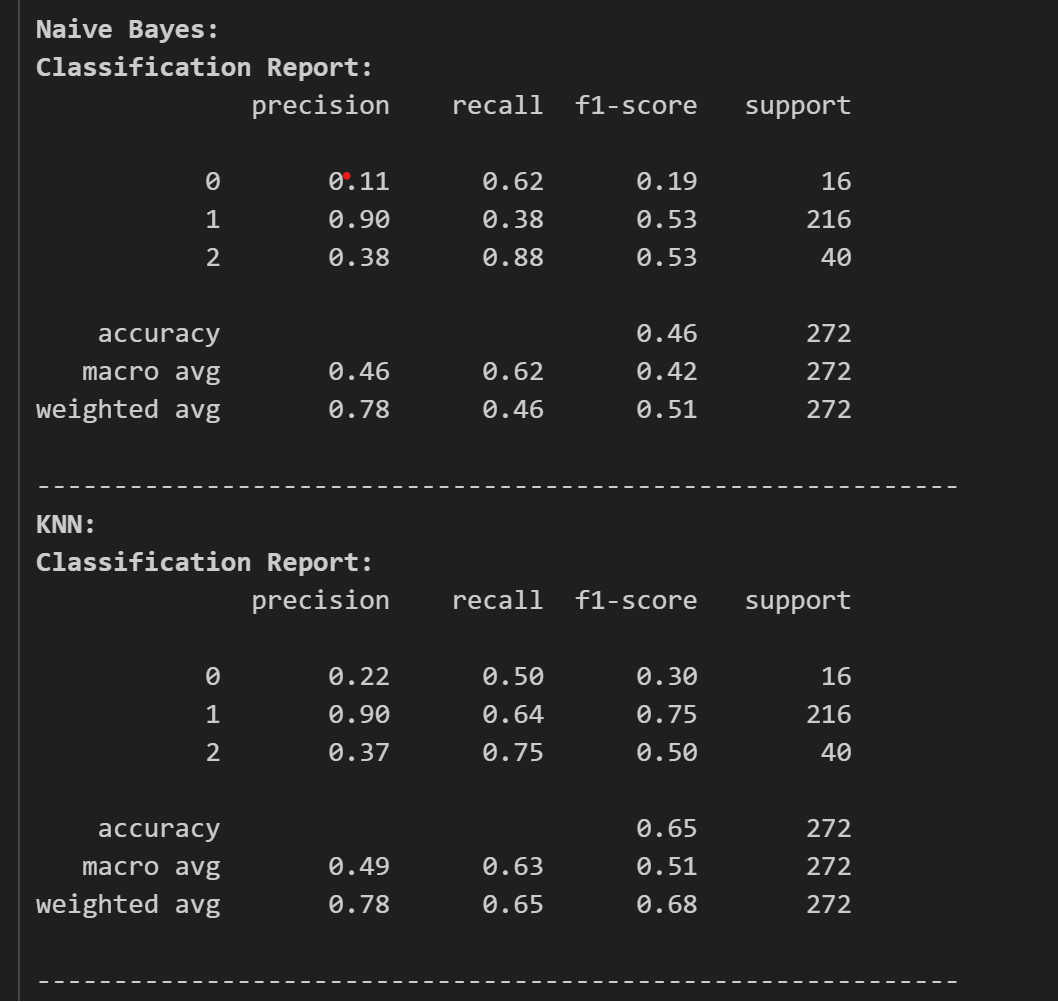
Now, looking at the classification report, we chose CatBoost as our classifier and as our model. Now, we tune the model for its best performance and accuracy. For this we use optuna for tuning the model.
import optuna

def objective(trial):
  model = cb.CatBoostClassifier(
  iterations=trial.suggest_int("iterations", 100, 1000),
  learning_rate=trial.suggest_float("learning_rate", 1e-3, 1e-1, log=True),
  depth=trial.suggest_int("depth", 4, 10),
  l2_leaf_reg=trial.suggest_float("l2_leaf_reg", 1e-8, 100.0, log=True),
  bootstrap_type=trial.suggest_categorical("bootstrap_type", ["Bayesian"]),
  random_strength=trial.suggest_float("random_strength", 1e-8, 10.0,
  log=True),
  bagging_temperature=trial.suggest_float("bagging_temperature", 0.0,
  10.0),
  od_type=trial.suggest_categorical("od_type", ["IncToDec", "Iter"]),
  od_wait=trial.suggest_int("od_wait", 10, 50),
  verbose=False
  )
  model.fit(X_train, y_train)
  y_pred = model.predict(X_test)
  return accuracy_score(y_test, y_pred)

study = optuna.create_study(direction='maximize')
study.optimize(objective, n_trials=30)
print('Best hyperparameters:', study.best_params)
print('Best Accuracy:', study.best_value)
After this, the tuned parameters were passed into the model and we got the final accuracy of the model and our model was devised to the test accuracy of 77.57% which is higher.
model = cb.CatBoostClassifier(**study.best_params)
model.fit(X_train, y_train)
y_pred = model.predict(X_test)
acc_score = accuracy_score(y_test, y_pred)
acc_score
Hence, we can now predict the quality from the array of constituents value.
# taking the input
df_columns = list(redwine_test_df.columns)
test_array = []
for col_name in df_columns:
  if col_name == "quality":
    continue
  else:
    data = float(input(f"Enter the {col_name} quantity
    [{redwine_test_df[col_name].min()} - {redwine_test_df[col_name].max()}]: "))
    test_array.append(data)

# giving the data to our model
q_value = model.predict(test_array)
if q_value == 1:
  print("The red wine is of medium quality!")
elif q_value == 2:
  print("The red wine is of high quality!")
else:
  print("The red wine is of poor quality!")
Here, we tested a random sample of wine and we got the wine quality as average. Clearly helping with the outliers of the chloride really made improvement in our model.
IV. Significance
So, the question may arise about its significance. Companies can use this technique of ML for creating better models and by using the dataset with thousands of data. This is just a simple dataset for devising a method for relating the quality of red wine with its physicochemical properties. General laymen can indeed know about what factors can affect the quality of red wine by analyzing the dataset in the visualization part. These algorithms and techniques can not only be used here but in every field of response and target variables, which can indeed boost our capabilities.
The link for the github repository for this project is here:
Code for Nepal would like to thank DataCamp Donates for providing Prabesh, and several other fellows access to DataCamp, to learn and grow.