Comprehensive Examination of Superstore Sales Trends and Performance Analysis
20 Dec 2023 - Ayush Adhikari
Data analysis is pivotal in fostering business growth. Owners must possess a comprehensive understanding of their business analytics to strategically elevate profitability. However, meticulously tracking every sales pattern, discerning customer behaviors, and assessing profitability proves challenging for owners. This is where Data Analysis becomes indispensable. A proficient Data Analyst adeptly uncovers latent sales patterns, delineates diverse trends, and establishes correlations between various parameters. Equipped with this invaluable information, owners gain the ability to target and fortify weaker aspects of their business.
For example, manufacturing companies often record the runtime, downtime, and work queue for various machines and then analyze the data to better plan workloads so the machines operate closer to peak capacity.
Now, let’s examine the sales data from a big store worldwide. This project serves as a concise illustration of the diverse sales patterns perceivable within data, offering valuable insights and actionable conclusions that hold the potential to positively impact your business operations.
We’ll use the Pandas library to handle our data — importing, cleaning, and organizing it. For visualizing the data, we’ll turn to Matplotlib and Seaborn libraries.
DATASET
https://www.kaggle.com/datasets/fatihilhan/global-superstore-dataset
Importing Libraries
We have used “read_csv()” function from Pandas library to import the dataset.
A First Glimpse
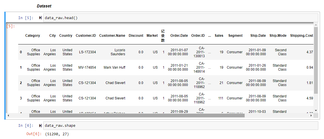
We’ve got 51,290 rows and 27 columns in our data. The products are categorized into ‘categories’ and ‘sub-categories’ columns. Each row has details like product name, customer, order date, order ID, profit, discount, and more.
We’ve got an unspecified column that needs to be removed. After that, we’ll dig into each feature in our dataset to gather insights.

Once we’ve gathered plenty of info about our data, it’s time to visualize and extract insights.
Visualizing the Data
Let’s check what is the number of orders per category.
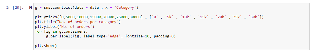

This graph tells us that around 60% of orders are for Office Supplies, followed by Technology and Furniture categories.
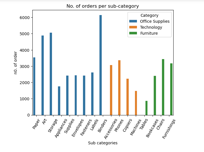
Looking at the chart, we see that around 55% of sub-categories belong to Office Supplies. This explains why 60% of orders are for this category. Similarly, Binders are popular compared to others, followed by Storage and Art sub-categories.
Now, let’s look at the Discount column.
Out of 51,290 orders, 22,281 were made with discounts, roughly 45%. It looks like most people prefer buying discounted items. On average, the discount is around 15%.
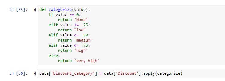
Next, we’ll group the discount percentages into categories: none, low discount (0–25%), medium discount (25%-50%), high discount (50%-75%), and very high discount (75% and above) to gain deeper insights.
Let’s plot the chart of orders per discount category
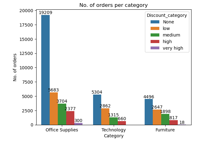
When we look at the chart, it’s clear that ‘Office Supplies’ gets higher discounts. Most orders have low discounts, but a few have high discounts.
Let’s find out which types of customers are more likely to order.
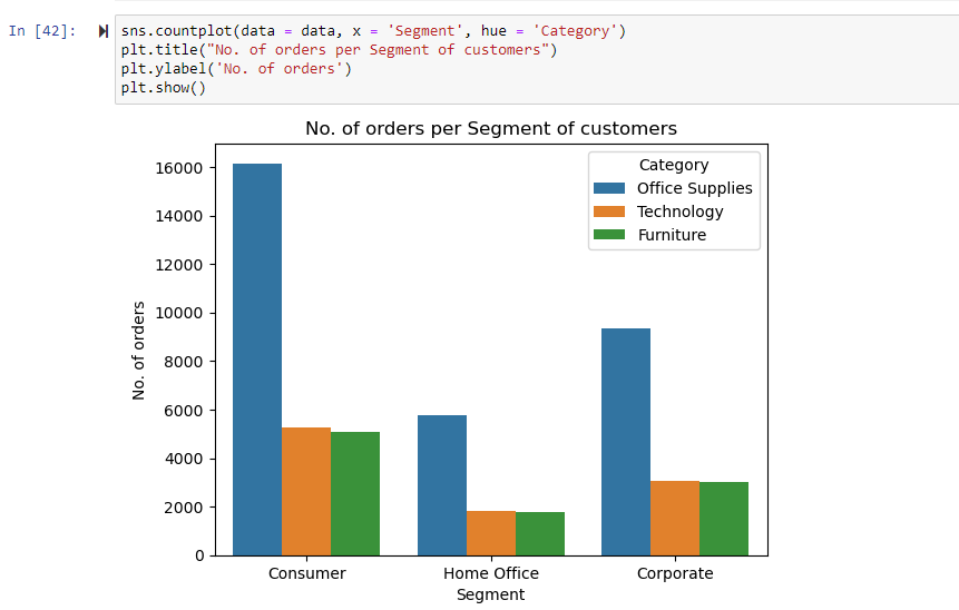
The chart shows most orders come from customers, followed by corporations and the Home Office. All categories seem equally popular among these segments. There isn’t a specific category that stands out for any particular segment.
Now, let’s see which shipping mode is used the most.
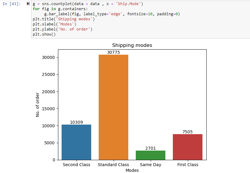
From this figure, we can say Standard Class shipping mode is mostly used roughly 55- 60%.
Now, let’s check sales in each market.
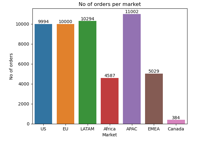
The Asia-Pacific region has the highest sales, followed by the US, EU, and LATAM regions. Sales are lowest in Canada.
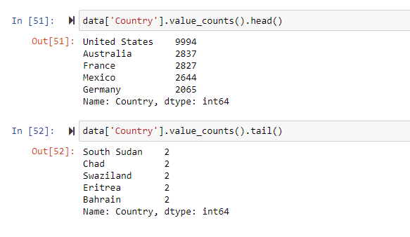
Most orders are from the US superstore (9994), followed by Australia (2837), France (2827), Mexico (2644), and Germany (2065). Supermarkets in South Sudan, Chad, and Swaziland have the fewest orders.
Let’s explore the profits now.
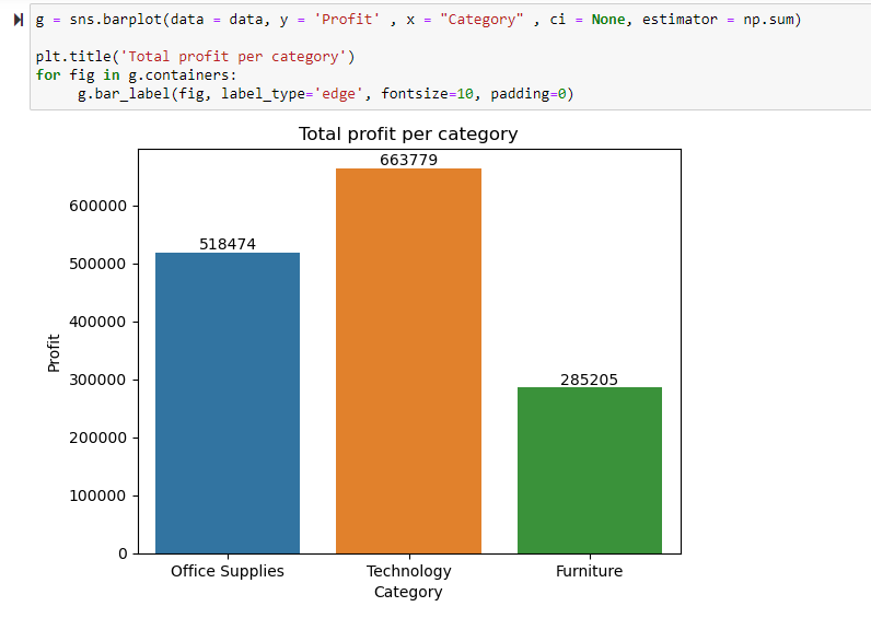
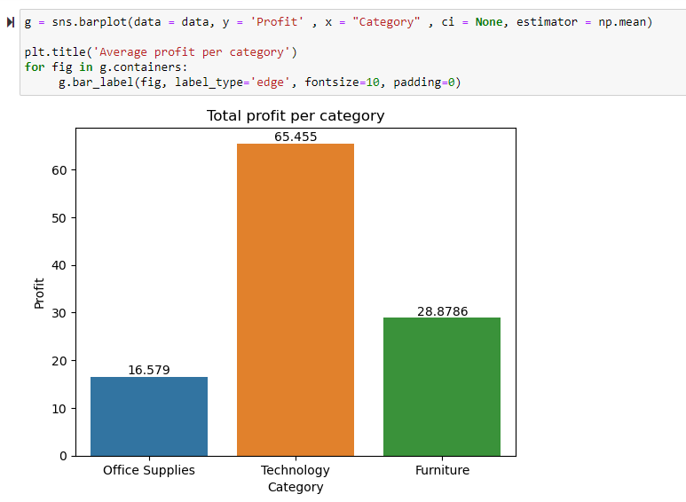
This chart reveals that the technology category has the highest net profit, followed by office supplies and furniture.
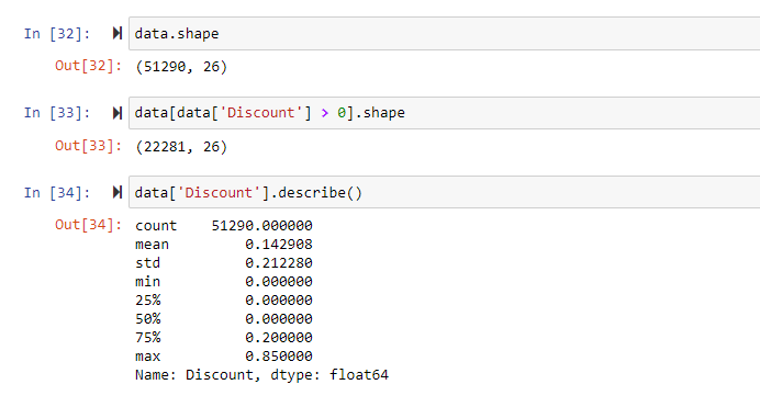
When it comes to average profit per order, Technology leads, followed by Furniture, while Office supplies have the lowest average profit per order.
Even though the office supplies category has more products, the Technology category sees a much higher average profit per order and net profit.
Let’s check the scenario for each sub-category.
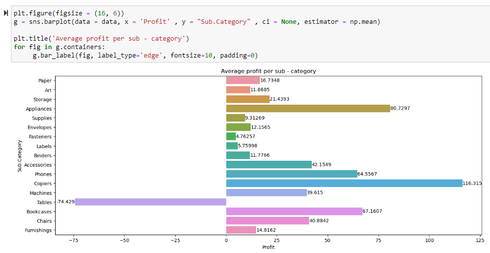
This chart highlights that Copiers generate the highest average profit across all categories, making $116.315 per order, followed by Appliances at $81. However, the Table category incurs a loss, averaging at -$75 per order.
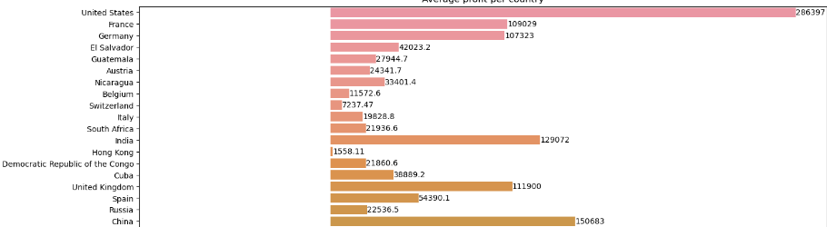
Next up, let’s check profits by country.

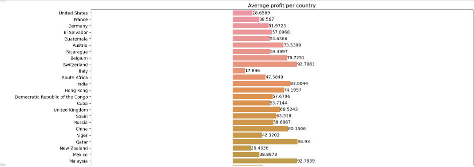
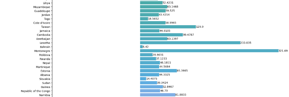
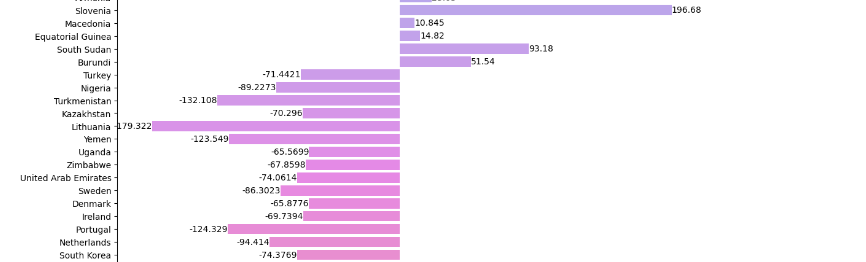
This chart shows that the supermarket in Montenegro is making the highest av. profit of 321.69 dollars, whereas Lithuania is making av. loss of 180 dollars.
Total profit per country:
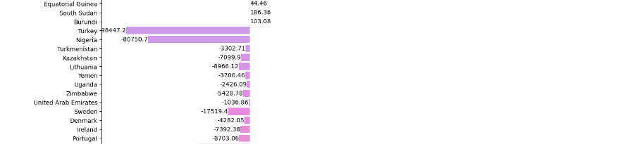
However, in the US, supermarkets are making the highest profit, totaling $29,000. And, Turkey, they’re facing the highest loss, amounting to $99,000, followed by Nigeria with a loss of $80,000.
A line plot showing the total profit per market across three years:
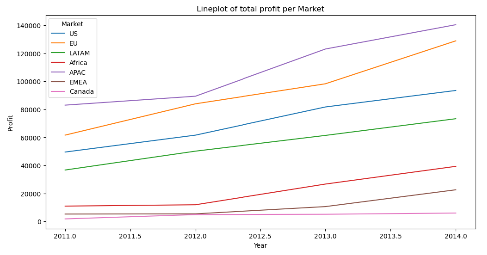
This line plot indicates that the total profit in the Asia-Pacific region has steadily increased and is the highest among the tracked periods.
Conclusions and suggestion
- The Office Supplies category has lots of products but makes less average profit compared to Technology.
- Since Technology has the highest profit, focusing on more products in this category could boost business.
- Customers are attracted by discounts. Offering around 15% off might increase sales.
- Careful discount allocation shows the company’s smart strategy.
- Most use the Standard Class shipping. Investing here could improve profits.
- Even though the US has a lower average profit per order, high sales result in high profits for supermarkets.
- The Table category faces significant losses, suggesting discontinuation.
- Asia-Pacific markets have good customer numbers and profitability
This project vividly demonstrates the transformative power of data analysis in optimizing business strategies. The utilization of graphs and tables unveils invaluable insights pivotal for business expansion. However, it’s crucial to recognize that data analysis isn’t confined solely to business realms; its influence spans across disciplines like scientific research, machine learning, and beyond. By embracing and mastering data analysis, individuals not only empower businesses but also contribute significantly to advancements in diverse fields. Ultimately, learning this skill emerges as a catalyst for personal and professional growth, opening doors to a multitude of opportunities.
Code for Nepal would like to thank DataCamp Donates for providing Ayush, and several other fellows access to DataCamp, to learn and grow.